top of page
.png)


Role
Design Lead
Tools
Figma, Miro
Timeline
Jul 2024 - Oct 2024
Background
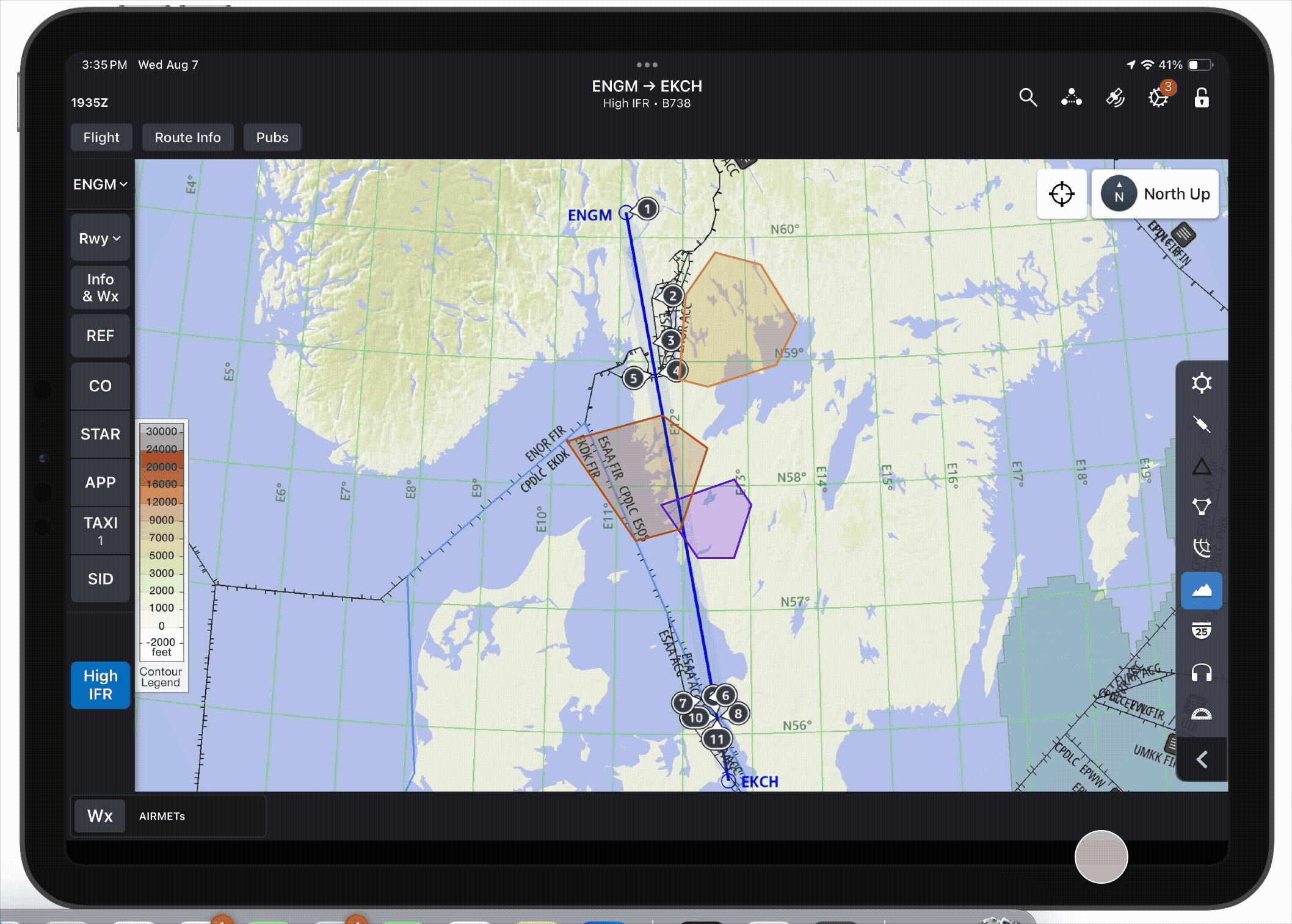
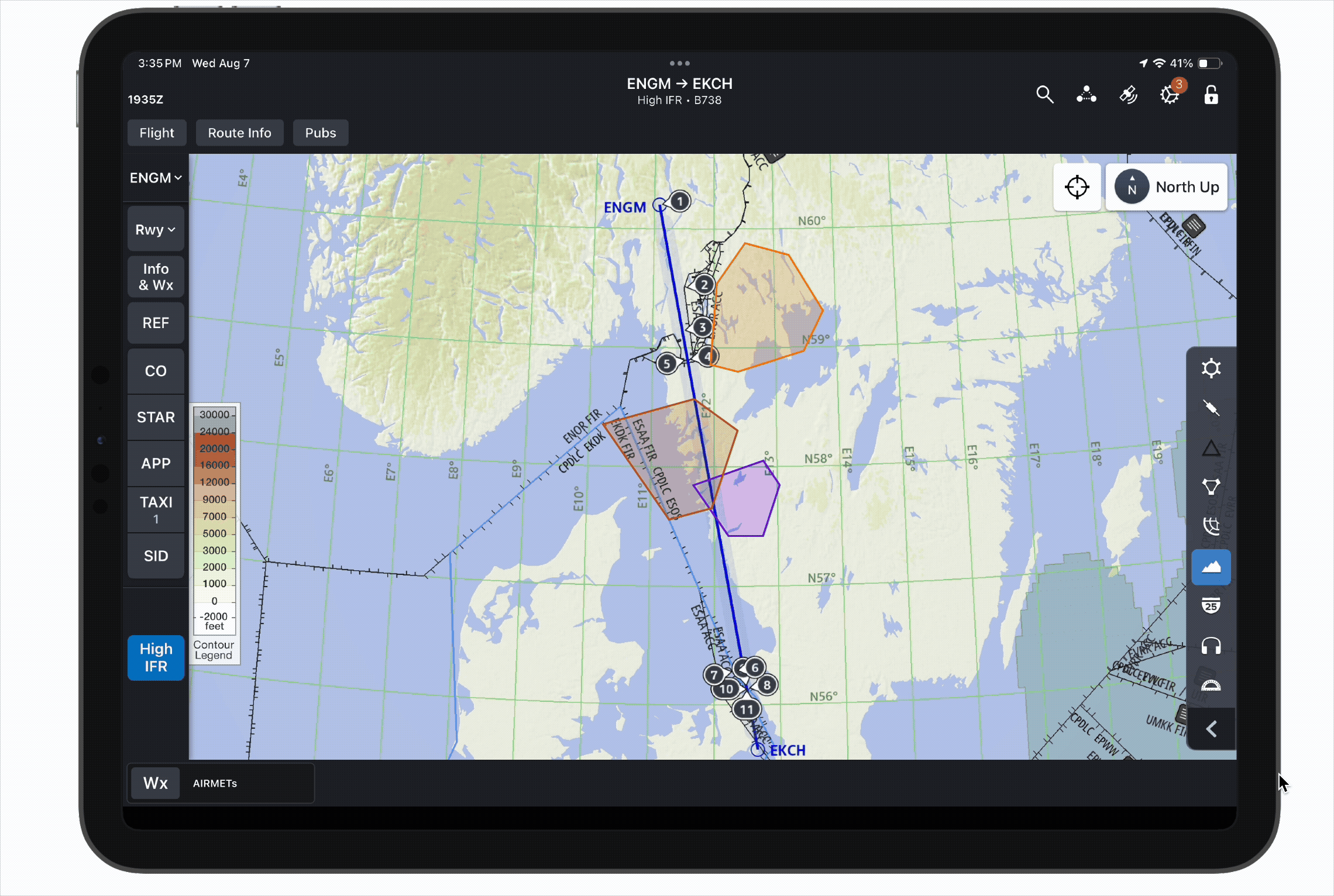
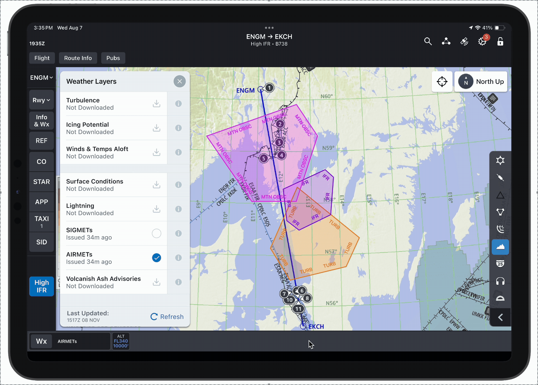
AIRMETs (Airmen's Meteorological Information) are weather advisories issued by meteorological authorities to inform pilots of potentially hazardous weather conditions that are particularly relevant to light aircraft over North America. There are six types of AIRMETs: Icing, Turbulence, Wind Shear, Surface Winds, IFR, and Mountain Obscuration.
Our sister product, Aviator, currently has their own AIRMETs weather layer. The Flitedeck Pro product team is looking to incorporate this layer into our product to allow users to access more weather information in one place.
Understanding the Problem
I began by conducting discovery interviews with a few pilots from one of our European customers to understans their grievances and needs.

1) Desire for Map Depiction
Users are familiar with text-based AIRMETs, but would like to see them visually depicted as polygons on the map.

3) Color Expectations
Users expect the following color/hazard pairs: blue for icing, orange for turbulence, and green for heavy precipitation.
2) Necessary Context
It is essential to see the associated altitude of an AIRMET in order to assess the threat it poses.

4) Hierarchy of Importance
Users at this airline care most about icing and turbulence hazards; IFR and mountain obscuration are less relevant.
Design & Iteration
Based on my user research and understanding of Aviator's AIRMETs layer, I began working on the following designs:
Precedented Color Legend
I began with the same colors that Aviator uses for their AIRMETs layer in my first iteration. While these colors are not entirely consistent with the guesses I heard in my discovery interviews, I wanted to start by assessing the effectivity of our precedent.
Aviator AIRMETs Legend

Raw AIRMET data contains a plethora of information. For the first round of designs, I parsed through the data and pulled out key values that I expected users to find helpful based on the data we provide in our pre-existing weather layers.

Object Details
GeoJSON Data
Presented Data
{"sourceName":"HWS4","rawDataHashValue":9075056164669707763,"rawData":"FAIT WA 141215\nAIRMET
TANGO FOR TURB/STG SFC WINDS VALID UNTIL 142015\nNORTH SLOPES OF BROOKS RANGE FH\nAFT 18Z W
ATIGUN PASS OCNL MOD TURB BLW 060. NC","created":"2024-08-
14T14:11:00.511Z","airmetId":"2","validFrom":"2024-08-14T12:15:00Z","validTo":"2024-08-
14T20:15:00Z","issuedAt":"2024-08-14T12:03:00Z","icaoSite":"PAFA","rawType":"MOD
TURB","type":"TURB","phenomenon":"TURB","lowerLevel":"SFC","upperLevel":"FL060","description":
"Turbulence","cacheTimestamp":"2024-08-14T14:11:00.001588Z","identifier":"2"},"geometry":
{"type":"MultiPolygon","coordinates":[[[[-163.63,68.48],[-160.37,70.03],[-158.09,70.02],
[-156.95,69.63],[-153.1,69.45],[-151.22,69.15],[-149.7,69.46],[-148.69,69.41],[-147.56,69.52],
[-142.64,69.35],[-141.21,69.45],[-141.0,69.4],[-141.0,68.5],[-142.2,68.58],[-142.63,68.87],
[-143.12,68.77],[-143.9,69.02],[-148.1,68.43],[-148.48,68.25],[-151.27,67.92],[-151.86,68.18],
[-152.99,68.04],[-152.7,67.77],[-154.1,67.85],[-154.6,67.88],[-155.57,68.05],[-158.78,68.48],
[-160.32,68.56],[-162.93,68.31],[-163.63,68.48]]]]},"id":"98563828-6b18-48dc-81ce-
8f0fa6606575"},{"type":"Feature","properties":
Coordinate data indicating affected region
Issued Time
Validity Period
AIRMET Type
Altitiude
Remarks

Selected State
Because users had emphasized the importance of seeing AIRMETs' altitudes, I also included an altitude flag in the selected state to make this data more salient.
For the selection treatment, I followed our precedent for a similar weather layer that already exists in FliteDeck Pro: a #00B362 fill and border.

AIRMET Labeling
While I wanted to see whether users would be able to guess which color paired with which AIRMET type without guidance, I anticipated that colors alone might not be enough. At the end of the session, I included a brief A/B test with two options of text labeling on each AIRMET.
Option A

Option B

First Test: Takeaways
A few usability sessions yielded the following results:
-
Users assume that blue AIRMETs are icing and orange AIRMETs are turbulence, but they don't know what the other colors mean.
-
Reddish brown (used for Wind Shear) causes confusion because it looks similar to labeled airspace regions.
-
Green (used for Surface Winds) is misleading because the color is generally associated with "good" conditions, whereas in this scenario, it indicates hazard.
-
Users prefer the Option B method of labeling AIRMETs (inside of the border).
-
Users want to filter out certain types of AIRMETs in order to declutter their screens when necessary.
-
Users want to tap on an individual AIRMET to learn its issued time, validity, and altitude.
-
It is confusing that the AIRMET changes color when selected.
-
Users want to filter AIRMETs by altitude so that they are only viewing AIRMETs relevant to their current or planned flight level.
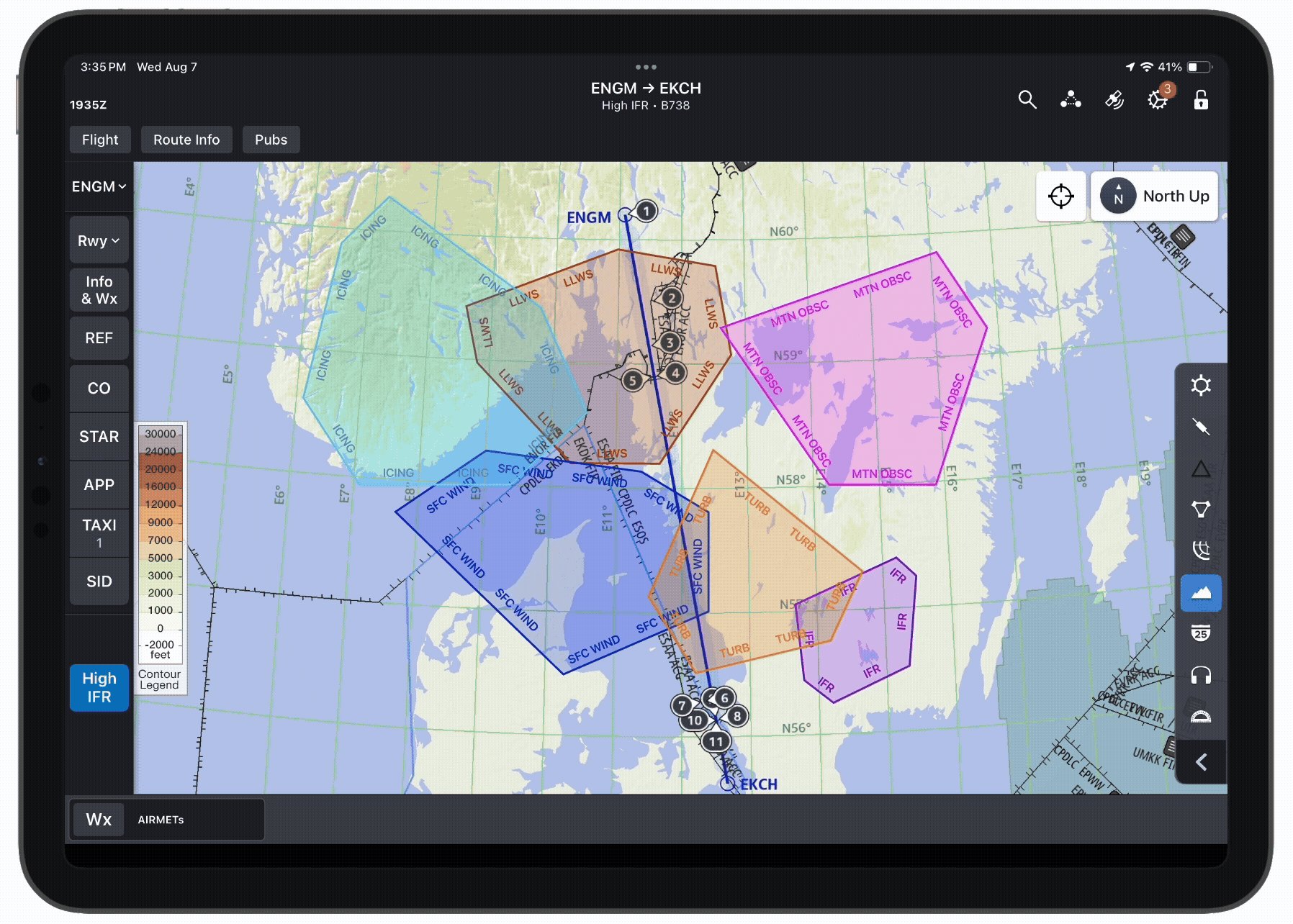
Iteration #2
Based on user feedback from the first round of user testing, I made the following changes:
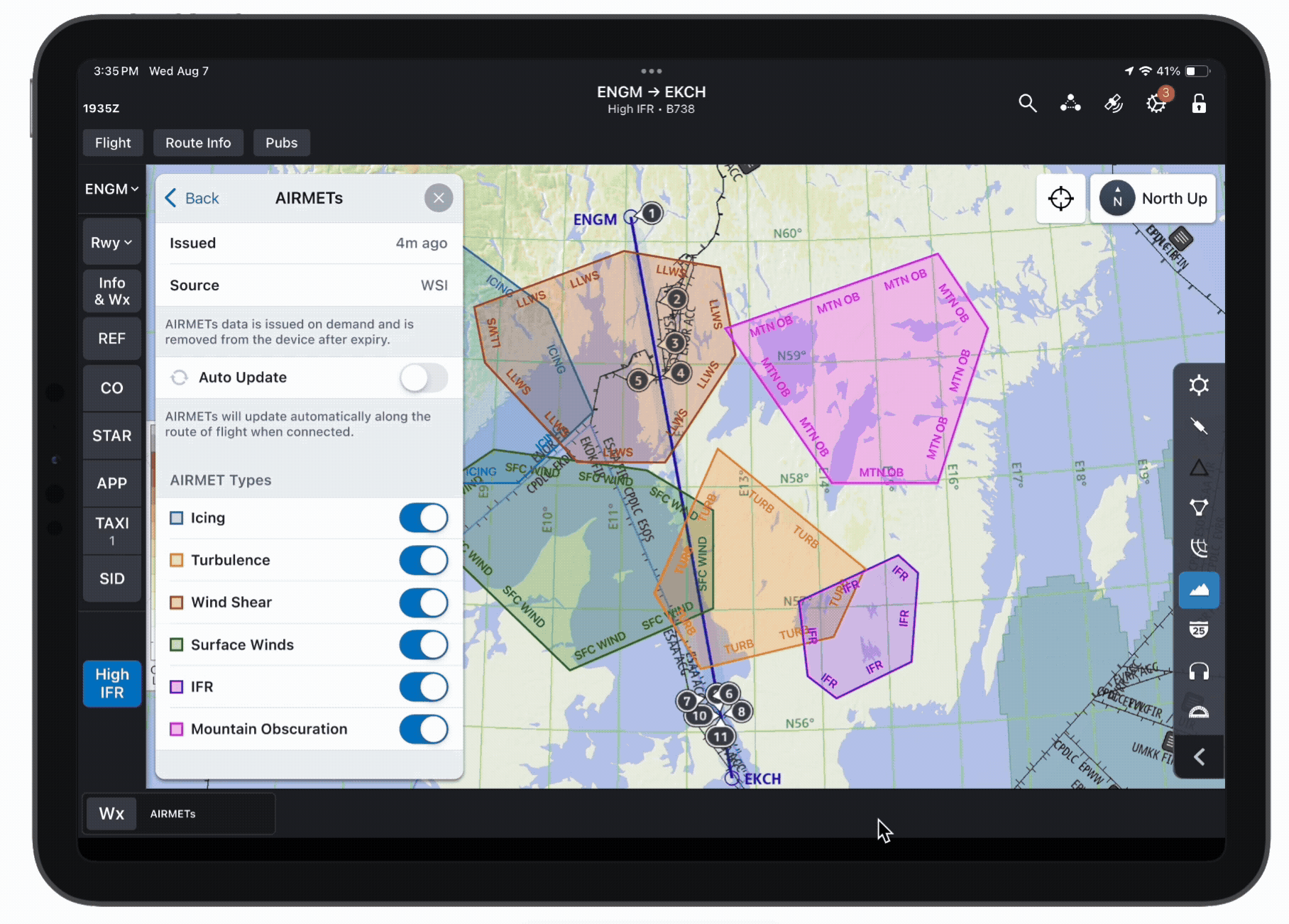
Selective AIRMET Legend
Because users expressed an interest in filtering out AIRMETs by type, I designed a new legend that allows users to toggle each type on and off.
I decided to use the same colors as before for this iteration, but I adopted the favored AIRMET labeling style from the previous test.
Altitude Slider
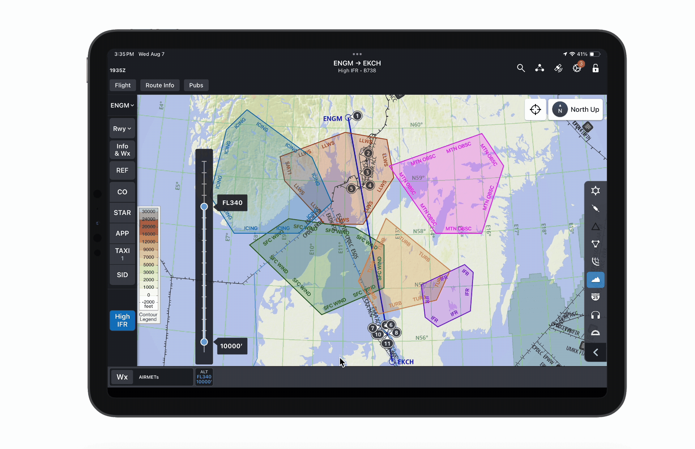
This altitude slider allows users to declutter the map by filtering out AIRMETs that occur outside of the selected altitude range.
Selected State Color & Opacity
This revised selection treatment retains the original AIRMET color to avoid confusion, but increases the opacity and adds black & white borders to stand out.

Second Test: Takeaways
Further testing yielded the following results:
-
Users share the sentiment that reddish brown and green AIRMETs will cause confusion; the other colors are fine.
-
Users like the option to toggle certain AIRMET types off, but worry that they will forget which types they disabled.*
-
The altitude selection flag is helpful, but users would also like to see the AIRMET type in this flag.
-
This selection treatment is preferable to the green, but users do not want the selected AIRMET to be fully opaque as it obscures the map beneath.
*E.g. a user may have the AIRMETs layer enabled and not see any turbulence AIRMETs because that specific type has been toggled off, and falsely think this means that there are no turbulence AIRMETs present.
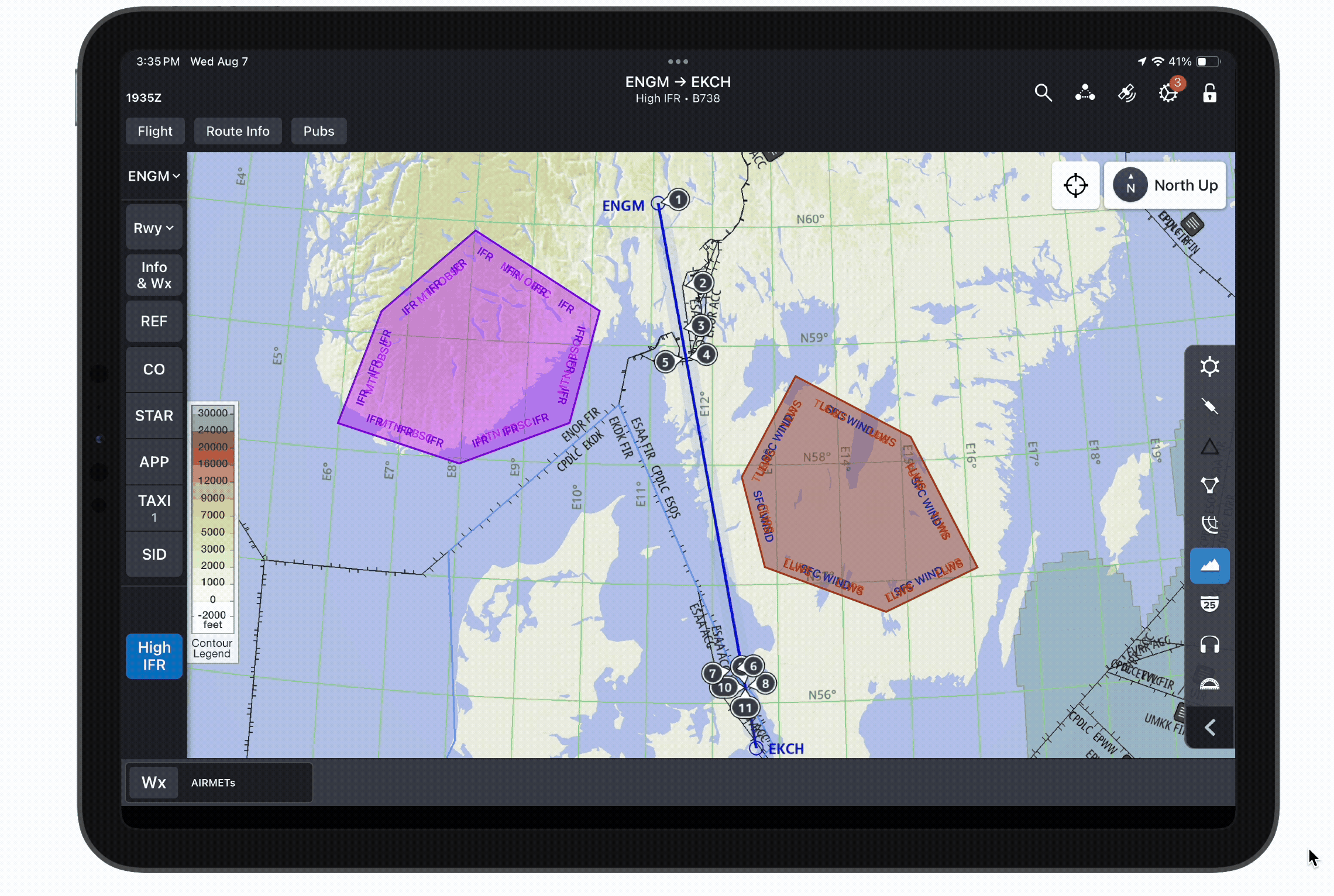
Iteration #3
Based on the above feedback, I made a few more tweaks:
Revised Color Legend
To resolve the uncertainty caused by maroon and green AIRMETs, I changed Lower Level Wind Shear and Surface Winds to a brighter red and royal blue, respectively.
I also made Icing a slightly brighter, lighter blue to reduce confusion with Surface Winds.


Disabled AIRMET Type(s) Indicator
To ensure that users do not mistakenly think a disabled AIRMET type isn't present, I added an amber dot in the AIRMETs cell of the weather selector sheet.
This dot appears when 1) the AIRMETs layer is enabled, and 2) any of the six AIRMET types are toggled off.
When the user disables the Mountain Obscuration type and then returns to the weather layer selector, the amber dot appears in the AIRMETs cell to indicate that not all types are displayed.
Updated Selection Treatment
Per users' suggestions, I added the AIRMET type to the selection flag, and reduced the opacity of the selected AIRMET so as not to obscure the map beneath.

Stacked AIRMET Depiction
I also needed to finalize designs for when multiple AIRMETs overlap perfectly, which does occur in some regions (mainly Alaska).
When the user taps on an area where multiple AIRMETs overlap, the location inspector appears with a preview of each present AIRMET (sorted by altitude). The z-order on the map matches.
Tapping on an AIRMET's cell from the location inspector invokes that AIRMET's object details. That AIRMET then enters the selected state (heightened opacity + borders) and moves to the top of the stack.
After the third round of testing went smoothly, I decided we had met our MVP and were ready for implementation.
Takeaways
When working on a product that is already robust and comprehensive, it can be easy to fall into the pattern of following precedents blindly. Because the AIRMETs weather layer already exists in our sister product, Aviator, I initially assumed that the most logical course of action would be to mimic their design.
However, this project reminded me that when a precedented design is not meeting users' needs, it is better to deviate than to stick with a subpar design for consistency's sake. While these new designs may cause growing pains for users who are used to Aviator's depiction of AIRMETs, I ultimately decided that this potential learning curve was justified by the users' feedback. Towing the line between improving outdated designs and maintaining consistency is a constant challenge in UX design, and this was a great chance for me to practice that balancing act.
Maintaining consistency with precedents

Improving mediocre designs
Thanks for reading!
bottom of page