top of page
.png)
.png)
Tools
Figma, Miro
Role
Design Lead
Timeline
Jun 2025 - Sep 2025
Background
Graphical Turbulence Guidance Nowcast (GTGN) is a weather product created by the National Center for Atmospheric Research. It uses a combination of observed turbulence data and its own advanced forecast model to display current turbulence patterns, as well as a short-term forecast.
This differs from our pre-existing turbulence layers which only display reported (past) turbulence. Implementing this additional layer will help give users a more accurate expectation of incoming turbulence and increase their situational awareness.
Understanding the Problem
Internal Research
To understand the goals and constraints of this project, I set up time with a couple of of our PMs, as well as one of our engineers who specializes in meteorological data.
One question that arose was whether we would need to standardize turbulence data to fleet size. Because the same level of turbulence will affect a lighter aircraft more severely than a heavy one, some users prefer see a representation of turbulence that has been adjusted to the weight of their fleet.
Turbulence is measured by Eddy Dissipation Rate (EDR). The International Civil Aviation Organization (ICAO) uses the following table to adjust EDR values to severity based on fleet size.
However, different turbulence products use different tables for this severity adjustment. If we determined that we needed to standardize turbulence data, we would then need to decide if we could use the ICAO standardization table or if we needed to devise our own formula.

User Research
I conducted discovery interviews with a few pilots from some our our domestic customers to gain a deeper understanding of their grievances and needs.
Three major points emerged:
1) Turbulence Severity is Crucial
While users are careful to avoid turbulence falling under "moderate" and "severe" categories, they don't typically make an effort to avoid turbulence that is considered "light."


2) EDR Values are Meaningless
Users are not familiar with EDR values and don't care to see numbers associated with turbulence – qualitative categories like "moderate" are more helpful.
3) Color Expectations
Users assume that light yellow corresponds with light turbulence, orange is moderate, and red is severe.

Understanding the Data
GTGN data comes through in GeoJSON format. The data is made up of complex polygons, each with a corresponding value between 0 and 1 that represents its EDR value. This data is available at different altitudes in increments of 10,000 feet.
GeoJSON Data
{"type":"Feature","geometry":{"type":"Polygon",
"coordinates":[[[-109.75469756296499,45.34969081914437],[-109.91599960481096,45.340257694004684],[-109.95851367153753,45.299551737704235],[-109.90486193209875,45.26932059249775],[-109.84926573488971,45.19355161940291],[-109.73001615901988,45.19060523572247],[-109.56843469428985,45.196525045904835],[-109.46294436712171,45.223088624895794],[-109.58469690332379,45.302591232713624],[-109.68903949843724,45.32035470501661],[-109.75469756296499,45.34969081914437]]]},"properties":{"threshold":0.4}},

The block of code to the left represents one individual area of turbulence.
The data highlighted in orange represents the coordinates of the polygon (i.e. its location on the map, while the data highlighted in purple contains the EDR value (i.e. severity of the turbulence).
Design & Iteration
Iteration #1
To get started, I rendered the geoJSON data over the map using the same color legend we use in one of our existing turbulence layers. I always like to test how effective our precedents are before deviating.
Because we weren't sure yet if adjusting the turbulence severity to fleet size was necessary, I began by testing turbulence represented by objective EDR values, and planned to ask whether this unadjusted data was sufficient.


First Test: Takeaways
I ran a few cursory usability sessions where I asked users to enable GTGN data, interact with the layer info, and interpret the data displayed on the map.
-
While users expect that turbulence ranges from yellow to red as it increases in severity, they don't expect to see any gray.
-
Users do not care to see "smooth" turbulence – they only need to see "light-mod" and above (reflecting what we heard in our discovery interviews).
Some users actually did not clock the gray as turbulence on the map – they interpreted it as cloud cover.
-
Fleet standardization of turbulence is helpful, but not necessary. An objective measure of the severity is sufficient.
Iteration #2
Based on feedback from the first round of user testing, I made the following changes:
Option A

Option B

Ability to Remove Lighter Turbulence
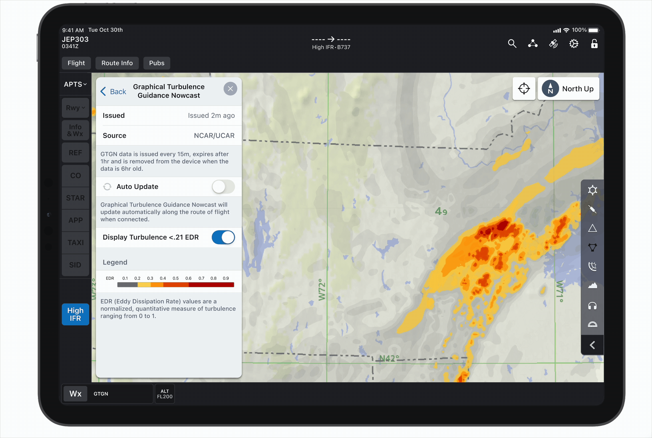
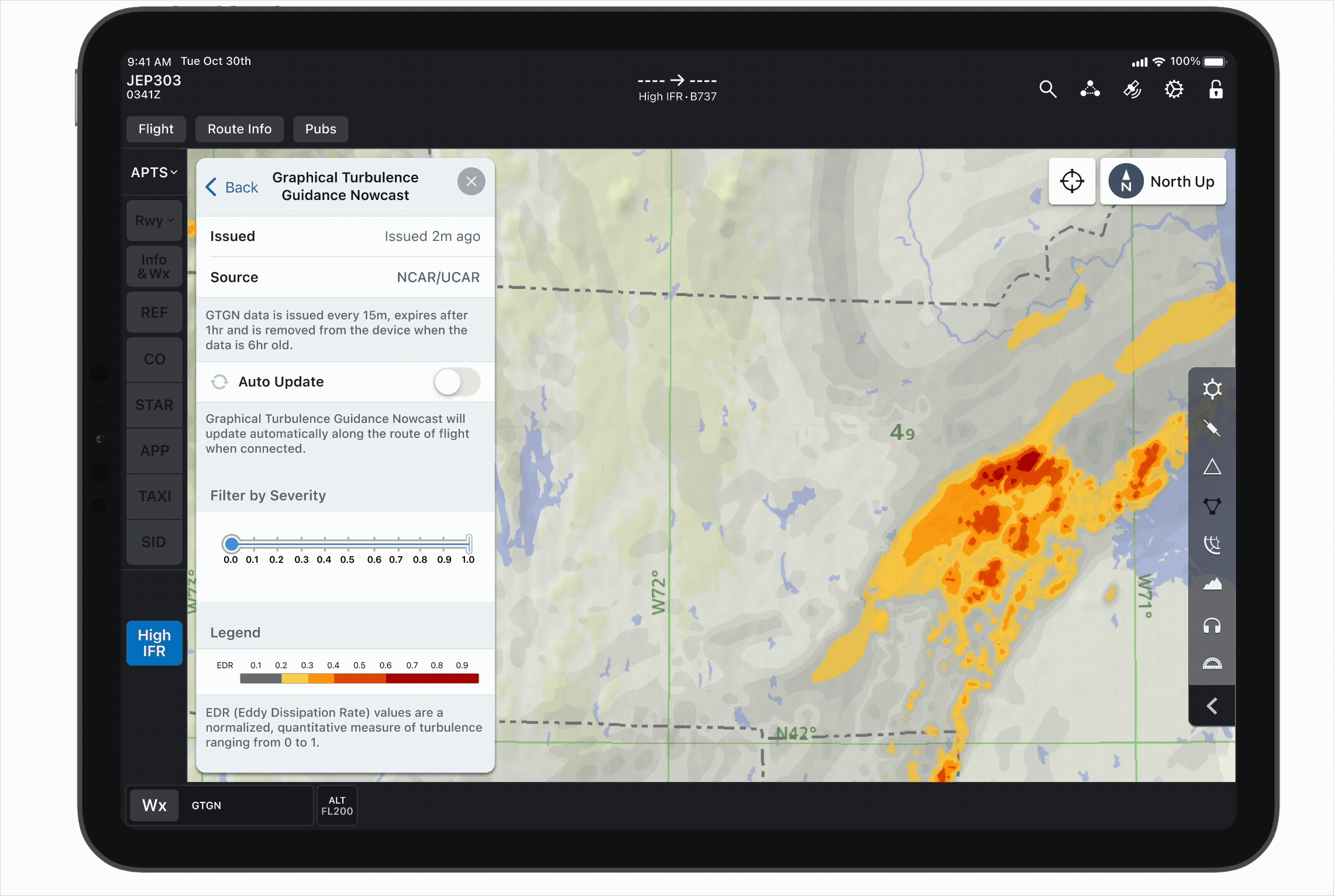
Because users expressed that the lighter level of turbulence is often irrelevant, I designed a couple of options to remove it from the map.
Option A allows users to disable the lightest level of turbulence (EDR values below .21), while Option B allows the user to adjust the minimum turbulence displayed to an EDR value of their choosing.
User toggles off "Display Turbulence <.21 EDR" to remove lightest turbulence from the map.
User adjusts slider to remove altitude below various EDR values from the map.
Although the users didn't love the gray turbulence in the previous test, I decided to wait on trying a new color. Because I was still waiting to see whether or not we needed to display the lightest level of turbulence at all, I didn't want to modify its map depiction just yet.
Second Test: Takeaways
In testing the two methods of removing light turbulence alongside the original gray, yellow, orange, and red color legend, I gathered the following insights:
-
Users really liked having the option to remove lighter turbulence from the map – they strongly preferred Option B (the slider) for greater precision.
-
These users have a strong desire to see turbulence adjusted to their aircraft size; they do not find objective EDRs very helpful and would not choose to use a non-fleet-adjusted turbulence product.
However, several users still wanted the option to view all levels of turbulence, including light.
-
The gray depiction of light turbulence is still confusing. Users say it looks like satellite clouds, not turbulence.
Iteration #3
In accordance with the above feedback, I made the following changes:

Updated Color Legend
Because the gray color continued to cause confusion, I decided we had sufficient reason to deviate from our precedent and try something new. I changed the lightest level of turbulence to a pale yellow in order to stay consistent with the typical turbulence palette.
I also incorporated the legend into the slider to make it more obvious which level(s) of turbulence the user is filtering out.

Weight Class Standardization
The second group of users expressed strong interest in seeing the turbulence severity adjusted to the aircraft size.
I created the following table and corresponding legends based on the ICAO guide seen above. This indicates the severity of turbulence at different EDR thresholds in relation size of the aircraft, based on three weight classes.


Standardization Footer Note
While users want to know that the turbulence severity has been adjusted to their fleet, they said that don't generally care to see the math behind that standardization.
A footer at the bottom of the sheet indicates that the severity has been adjusted to the currently selected fleet. To avoid inundating the users with superfluous data, I decided to hide the table and legends a level down. This way, curious users can still see the mathematical logic behind the standardization if (and only if) they wish.
Third Test: Takeaways
While testing the updated color legend and weight class standardization table, I learned the following:
-
Users initially liked having the option to use the filter to remove lighter turbulence, but when questioned further, they could not name a scenario where they would want to see the lighter turbulence.
-
While users are glad to know that the severity has been adjusted to their aircraft weight class, and the ICAO standardization table is sufficiently granular, users do not fully understand the wording of the footer.
-
The pale yellow light turbulence is slightly preferred to the gray, but users still do not like it. It is overwhelming to have the entire map covered with colored turbulence, regardless of the color or opacity.
-
Users want to loop through the data over a period of time to see data trends.
Iteration #4
Based on user feedback from the third round of user testing, I made the following changes:

Removal of Light Turbulence from Map
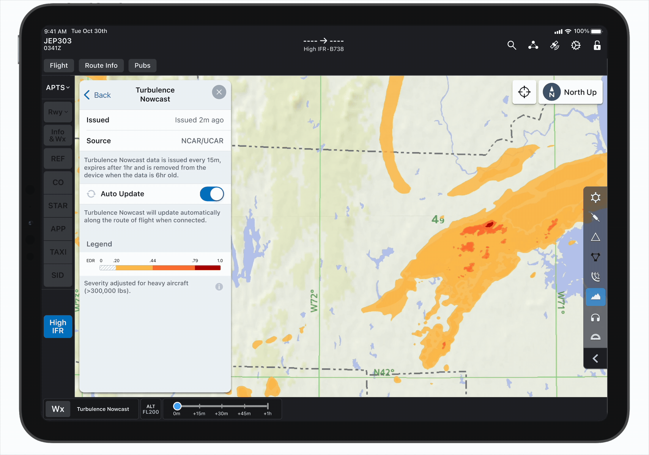
After several users commented that the lightest level of turbulence obscuring the map was distracting (both in gray and yellow), and that they didn't care to see light turbulence to begin with, I decided to test a design with this lightest level of turbulence removed completely.
Because users had no desire to remove higher levels of turbulence, the slider was now unnecessary, so I removed it.
Revised Legend
In order to simplify the legends, I removed all EDR values aside from those at changing points between severity levels. This prevents users from being distracted by values that are not acutely relevant to them.
I decided to keep the full range of EDR values on the legend for clarity and consistency, but filled the "light" portions with a translucent hashed pattern to indicate that those values are not depicted on the map.


Revised Standardization Message and Layer Name
Users had presented confusion about the "Severity normalized for [fleet]" message in the footer; it gave the impression that the severity had been normalized to their exact fleet. This updated messages clarifies that the severity is normalized to a particular weight classes, not to the individual aircraft.
After repeated frustration with the lengthy "Graphical Turbulence Guidance Nowcast" name, I took a user's suggestion and shortened it to "Turbulence Nowcast."
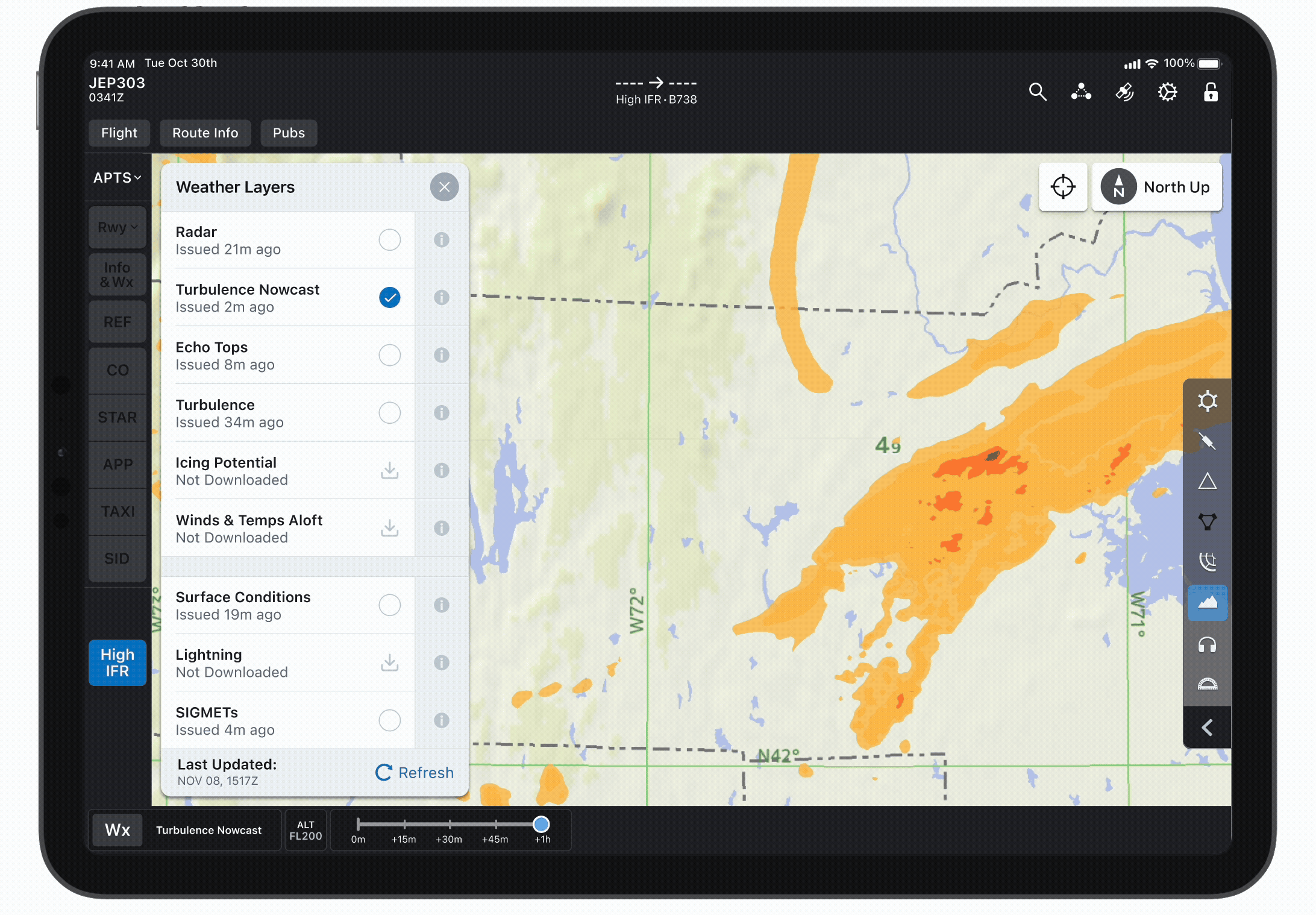
Historical Data Timeline
Because users expressed interest in seeing how the turbulence data had changed over time, I designed a timeline to show the past hour of data.
The data is valid for one hour and is updated evert 15 minutes, so the timeline includes the past four intervals.
Changing Fleets to Adjust Turbulence
I still wanted final confirmation that the process of adjusting turbulence to the fleet size was intuitive. To test this, I asked users to switch among fleets of sizes and observe how the turbulence displayed changed accordingly.
The user changes the fleet from a B738 (medium class) to a C172 (light class) to B763 (heavy class). As the fleet changes, the turbulence displayed adjusts accordingly.
After the fourth round of usability testing went smoothly and users found all tested workflows intuitive, I was confident that we had met our MVP and were ready for implementation.
Next Steps
While users agreed that ICAO weight class standardization was sufficient, I would love to focus on devising our own standardization formula that adjusts severity more granularly. A couple of users had mentioned that the ideal solution would be to standardize the turbulence to the exact weight of each specific fleet, a la SkyPath.
Based on my (admittedly limited) knowledge of aeronautical physics, I developed the following formula:
SI =
EDR
W
1/6
SI = severity index
EDR = eddy dissipation rate (objective measure of turbulence)
W = aircraft maximum takeoff weight
In the future, I would like to work with some of our engineers who have a more technical background to derive the most accurate formula possible. This way, we can provide users with a more specific understanding of how turbulence will affect their specific aircraft.
Takeaways
This project taught me that when working with highly complex data, the most effective designs often come from removing information, rather than adding more. Early iterations included additional legend values and multiple visual treatments for light turbulence, but user testing showed that these details created noise rather than clarity.
By simplifying my designs to remove data that is not highly relevant to the user, I learned how intentional reduction can make a product far more intuitive. Design clarity is not just about presenting data accurately – it’s about presenting only what truly matters for the user’s task.
Thanks for reading!
bottom of page